
Try Shutterstock Create, our easy and efficient online design tool. Craft professional social posts, promotions, presentation slides, email headers, and more.
Typography is fundamental to good design. While the actual copy plays an important role in delivering information, how the text looks can make or break your design.
Using text in images is easier than you might think. Here are some go-to tips for successfully implementing text in your next creative project.
1. Define Your Message
It’s hard to design without knowing your copy. Craft your copy with clarity and concision so you can pair it with an appropriate design. You’ll want images that not only fit the context, but also the length of the text.
The text should complement the imagery. If you have several lines of copy and complicated imagery, it might look better to place the text inside of a solid shape. On the other hand, minimal text could look dramatic when placed directly on an image.
2. Make It Legible
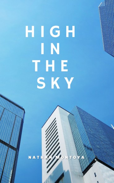
Readability should always be your primary concern, followed by the design of the text. Using clashing colors, muted fonts, or too many fonts can be a recipe for design disaster.
You can improve text visibility on top of an image by making the image lighter and the text darker—the more contrast there is between the colors, the greater legibility you achieve.
You can also create shapes and play with the opacity level to make portions of the background image lighter, framing the text without losing your message or the detail of the background.

Font choice also affects visibility. Sans serif fonts are usually easier to read in digital formats, although serif fonts work well stylistically in many circumstances. You can pair a serif and sans serif font for increased visual interest. Experiment with different fonts and see how they transform your text and its overall feeling.
For more on mastering the craft of font pairing, be sure to read this tutorial next: Discover 8 Essential Design Tips for Spot-On Font Pairing.
To blend this graphic square as we did, simply click Shapes or Graphics inside Create. (We chose Graphics for a little extra flair.) Select your favorite, then drag-and-drop to canvas.
Now, Right-click > Move layer to back. You’ll notice tons of font options popping up on the top toolbar. Click Fade & blend, then adjust the slider to suit your needs. Nice!
3. Use Intentional Text Placement

People tend to read text in similar ways, so there are some basic placement rules that you should keep in mind when designing with text. Placing a line of text above the focal point of the picture encourages viewers to read first and then consider the picture. Placing the text underneath the focus accomplishes the opposite.
Left-aligned text on images is usually read first, while viewers might read right-aligned text only after absorbing other elements.
As you place your text on the canvas, consider your target audience. What text placement may resonate best for them? If you were in their shoes, how would you prefer it? Relating with your audience happens before, during, and after the design process.
Be intentional each step of the way!
4. Customize Text Effects and Layouts
Create makes it simple to place text anywhere on an image. Inside the tool, click Text > Add heading to customize your message. Or, peruse the endless ready-made text layouts for inspo.
Once you drag-and-drop to the canvas, you’ll have customization options available to you for font sizing, colors, Shadow & Outline, Fade & blend, Curved Text, image fills, and so much more.
Take it one step at a time to see which options suit you best. Plus, don’t stress about making mistakes, as the Undo and Redo arrows live on the bottom toolbar for you to use anytime. You can make this process subtle, bold, easy, or advanced.
Then, for a little extra oomph, you can layer effects and textures onto the design for a wow-worthy look.

The text box can be moved around the canvas so you can test different placements, and you can also create a shape in which to place the text. Plus, if you don’t want to stress about font pairs, text layouts do the heavy lifting for you. Phew!
No matter the occasion, digital platform, or marketing needs you’re crafting for, remember that text, typography, and fonts are every design’s focal point. Steer the ship with text-smart designs that make your audience stick around a while.
Now, hop into Create and give it a whirl! You got this.
License this cover image mockup via Khosro, Memory Stockphoto, and yavuzunlu.


