
Learn three ways to make colorful, abstract gradients for social media backgrounds, website design, or artwork to hang on your wall.
One of Adobe Illustrator‘s most versatile tools is creating custom gradients. Gradients are essentially a transition from one color to the next that you can use in numerous ways in design, branding, or illustrations. They can work to create abstract patterns or add more depth to your vector artwork.
So, open up Illustrator and let’s start setting up our workspace!
Setting up Your Workspace
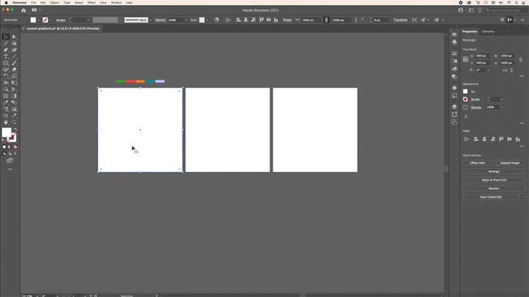
Today, we’ll be creating three different gradients. Create a new document in Illustrator with three separate artboards. They can be whatever dimension you need. I’ve set mine up to be 1200 x 1200 pixels with a RGB color mode for web.
Preparing Your Color Palette
If you want to keep a consistent color palette, be sure to set this up before you begin. We’ll be sampling these colors over and over so to save time, add your colors in by creating shapes with your fill colors. Then, set them aside in your workspace. You can also select your colors by using color swatches or codes later instead.
Adding Your Backgrounds
Next, you’ll need to create shape backgrounds for the three different gradients. Since our artboards are square, we’ll be adding squares to cover each artboard.
Use the Rectangle tool to create a perfect square by holding down Shift while dragging diagonally from one corner to the next.
Duplicate each square to the next artboard by holding down Alt/Option on your keyboard and dragging it over. You can do the same for the last artboard to finish this off.
Then, select the first square to get started creating our first gradient texture.
Freeform Gradients
Freeform gradients are used to create color stops in either points or lines to blend various colors together within a shape. These types of gradients are quick to set up and customize color blending. We’ll be creating two different freeform gradients.
Freeform Point Gradient
Our first gradient will be a freeform point gradient. We’ll be working with the Gradient panel. If you don’t see it in your workspace, go to Window > Gradients and pull it onto your workspace.
From there, you can see there are three Types of gradients to choose from. We’ll be working with the last one, Freeform Gradient. In the Draw option, select Points.
This will put a default gradient in your selected shape. Double-click each point to change the color. You can either change the color by using the Swatches, Color Code, or (the last option) Eyedropper icon. Eyedropper will allow you to sample colors from the color palette you prepared before.
Repeat this until you have all your colors set.
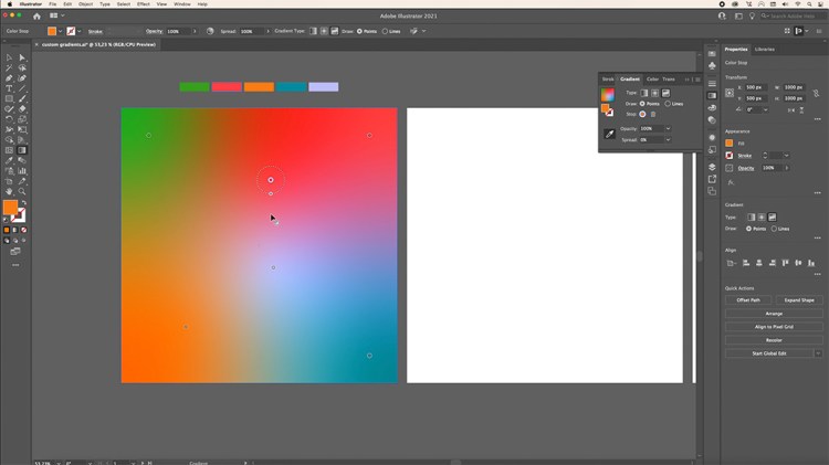
Press ESC on your keyboard once you’re done with your colors if you want to add more points to your gradient. To further customize it, move your points around to see how the colors interact with one another.
You can also change the Opacity and Spread in the Gradient panel to adjust these points, as well. Change the Spread by pulling the outer circle in and away from the point.
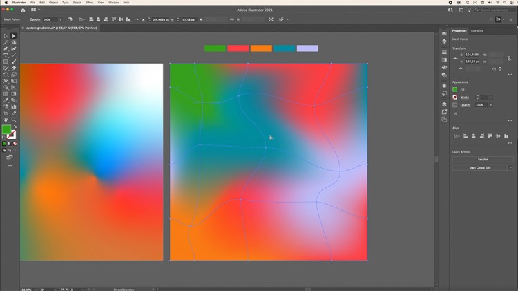
Freeform Line Gradient
Next, we’ll create a freeform gradient, but select Lines instead of Points in the Gradient panel under the Draw option. Here you can create color stops over a line segment or shape. This allows for more depth than our first point gradient.

Start by clicking any point and then clicking elsewhere in your shape to create your line segment. You can now move around. Curve your line and click when you’re ready to set it in position. You can keep going to continue your line or you can press ESC on your keyboard to work on another line.
Keep going until you have your lines created, then change the colors of each point by double-clicking and doing the same as we did for the point gradient. You can make the same customizations for Opacity and Spread as we did before.
Mesh Gradient
Lastly, let’s move onto our mesh gradient. This is an easy way to create an abstract gradient background, but also useful if you want to add depth to your illustrations by blending colors together in your artwork.
We can start creating this by using the Mesh tool in our Toolbar. Once you have your last background square selected, click anywhere on the square by creating the first grid of anchor points. Click again to add another set and keep going until you have all mesh points set.
From here, move around the various anchor points to distort the grid. You can also use the handles to change the direction of the lines that are intersecting the anchor points.
Once you’re done with your mesh grid, it’s time to start adding your colors. Head to the Direct Selection tool to select one single point. Then, use the Eyedropper tool to sample the color in your color palette.
To speed this up, you can select several points at a time and change the color using the Eyedropper tool to sample one color at a time.
Once you have all of your colors done, continue to move around your anchor points and handles to further customize your gradient.
Adding Effects and Textures
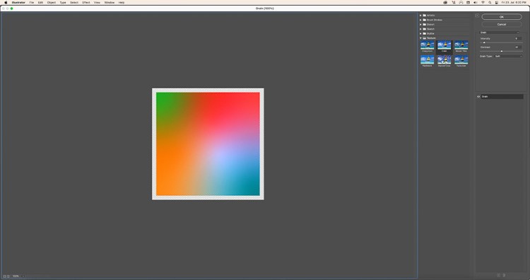
Now that we’ve finished our gradients, let’s upgrade them by adding textures from the Effect Gallery. I’ll share three of my favorites, but feel free to explore the different options and adjustments available to you by going to Effect (in your top menu) > Effect Gallery.
Grain
Our first effect we’ll be adding is Grain. You can find this by going to the Effect Gallery > Texture > Grain. This will add a subtle texture on top of our first gradient. I set the Intensity to 9, Contrast to 51, and Grain Type to Soft. You don’t have to follow these adjustments exactly. Take your time and see what works best for your gradient.
Click Ok when you’re done.
Glass
Our second effect is Glass, which can be found in the Effect Gallery > Distort > Glass. I set the Distortion to 6, Smoothness to 8, Texture to Frosted, and Scaling to 73%. You can play around with the different options and adjustments to find your desired result.
Once you’re done, click Ok and your effect is added onto your gradient.
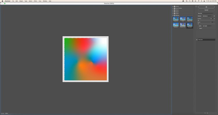
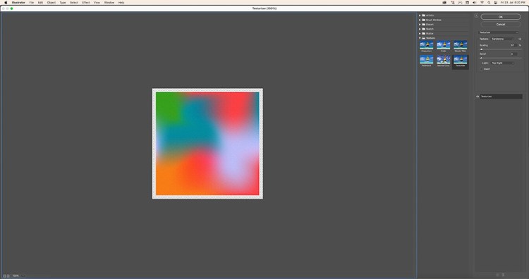
Sandstone
This last texture can be found in the Effect Gallery > Texture > Texturizer. I set the Texture to Sandstone. Experiment with the various Textures in the dropdown menu. I set the Scaling to 57%, Relief to 2, and the Light to Top Right.
Feel free to see what works best for you as you can see each adjustment in real time.
Now that you have several gradient techniques, explore and practice what you’ve learned here today. There are no rules when it comes to mixing colors together in a gradient, so experiment and see what you can come up with.
The magic of these textures is that they’re so versatile. You can use them in your logo, marketing material, greeting cards, and more. Get creative with these colors, shapes, and customizations to design something unique.
Looking for a simple place to start? Create’s simple one-click tool easily removes photo backgrounds for striking banners, product images, and more.


